Insight Tips
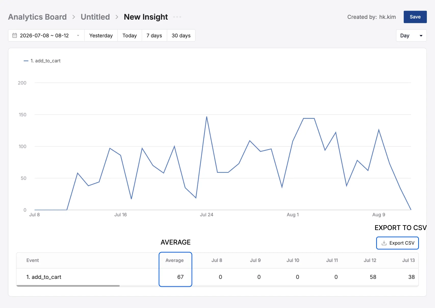
An Insight shows how one or more events changed over a period of time as a line graph.
- Whether purchases actually grew after a new product launch
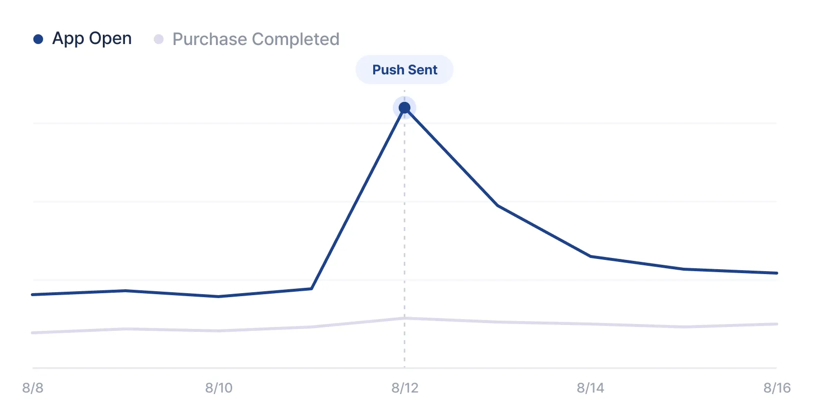
- Whether app opens spiked on the day you sent a push
- Whether one user group behaves differently from another
Creating an Insight
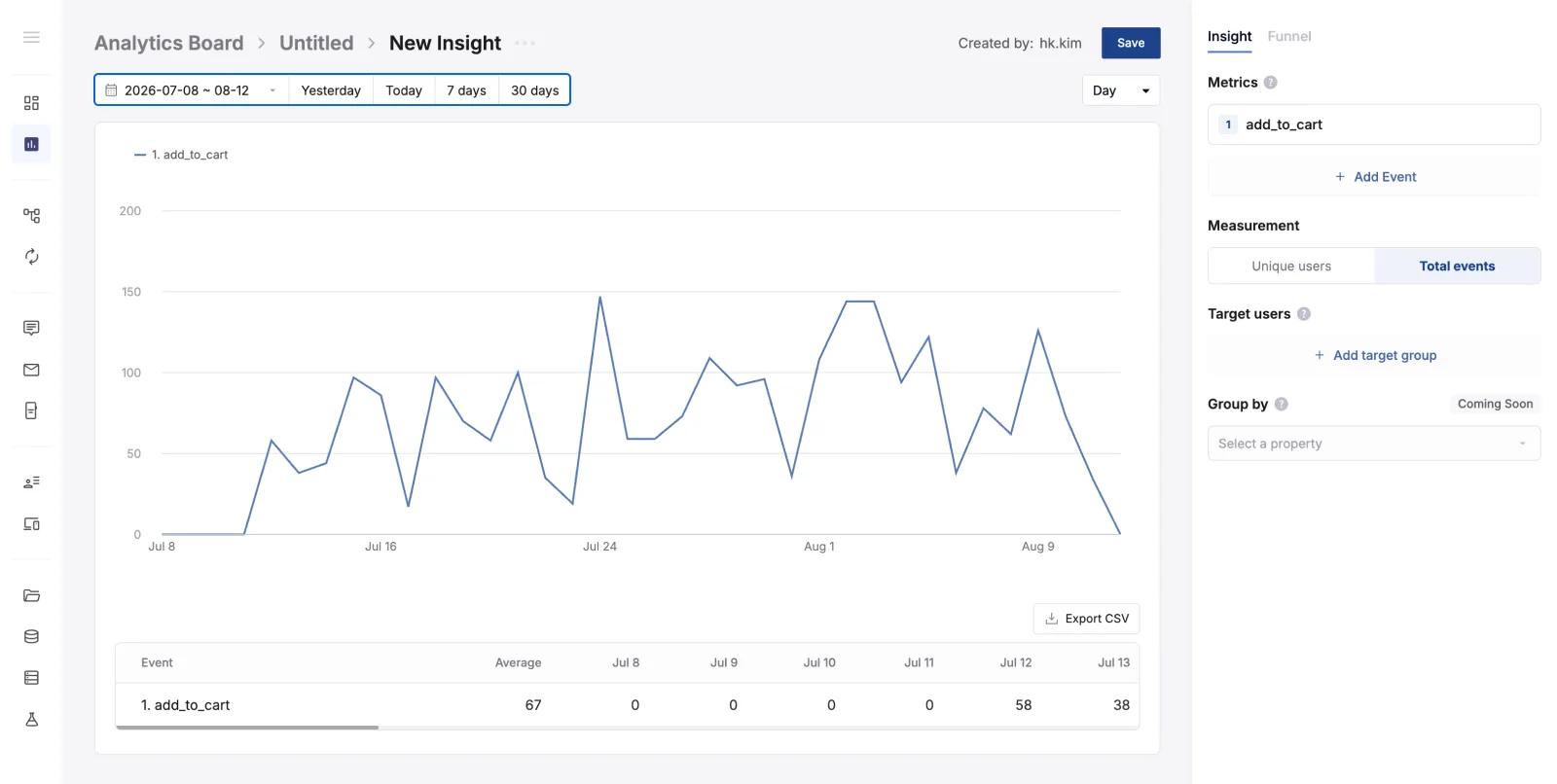
Section titled “Creating an Insight”- Select Create > Insight.
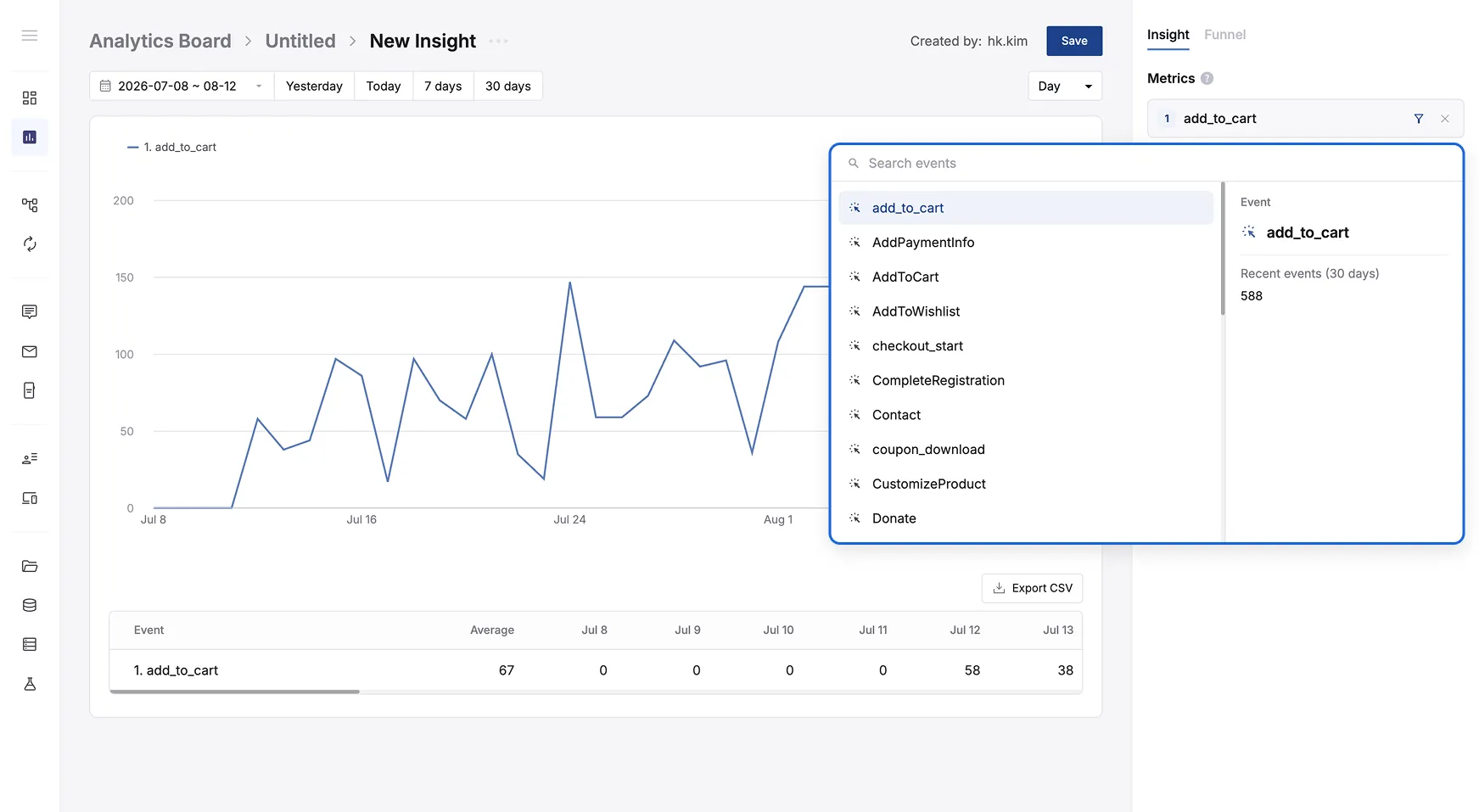
- In Metric, click
Add Eventand select the events you want to see. You can add up to 10.
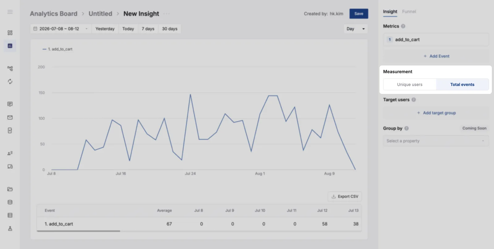
- Choose the Measurement.
Unique Useranswers “how many people did it”, andTotal Countanswers “how many times it happened”.
- Select the date range to query at the top.
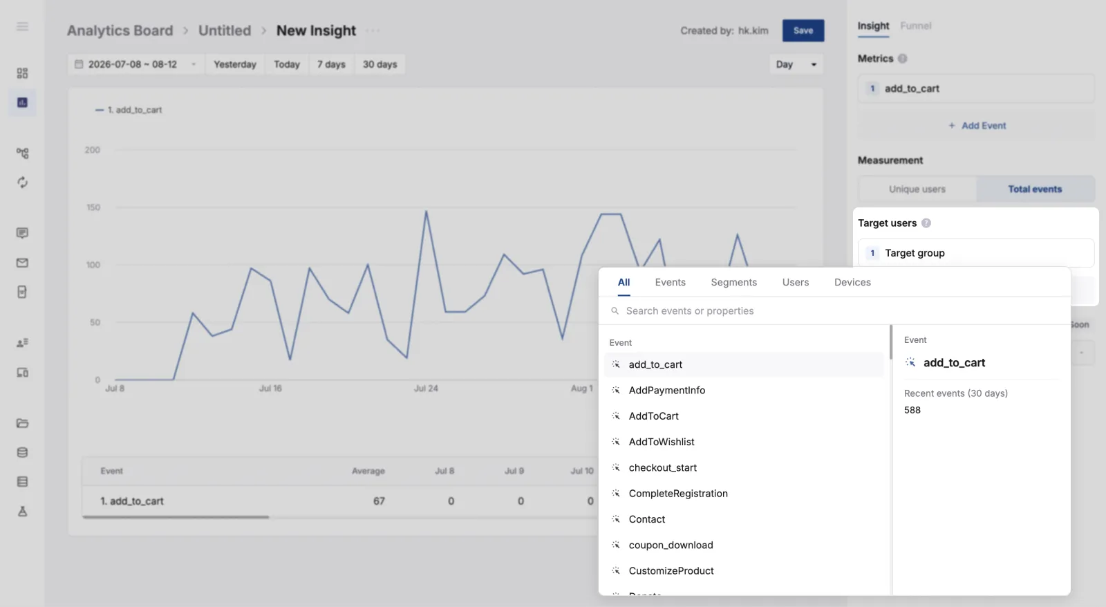
- Use Target User to set who the metric is measured for. If you leave it empty, all users are included.
- Click “Save” to save your changes.
Reading the graph and table
Section titled “Reading the graph and table”| Item | Description |
|---|---|
| Legend | Reflects the order and numbering of the events you added in Metric. |
| X axis | Follows the date range selected at the top. |
| Y axis | The unit depends on the Measurement set in the right panel.• With Unique User: how many people triggered the event.• With Total Count: how many times the event happened. |
| Time unit | Chooses the level of detail in the graph. For example, data between July 5 and September 5 can be broken down by hour, day, or month. |
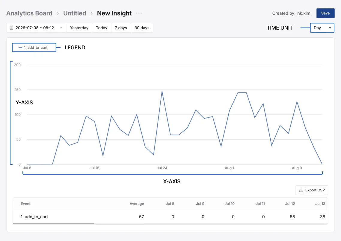
- Shows the same data as the graph, in numbers.
- The leading Average column shows the average over the selected period.
- The unit in the table also follows the
Measurementselected in the right panel. - Table contents can be exported separately as CSV.